Just wait a few years and they'll have a refresh and new front grill I am sure.
That seems pretty optimistic. Aside from 1.0’s 10yrs to get its refresh, any change in production costs on such a small (anticipated) annual production run seems like they'd keep it 'as is' for quite awhile for a decent ROI.
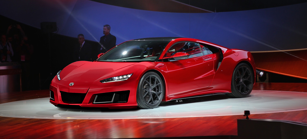
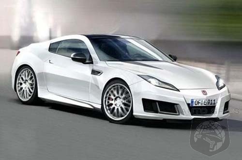
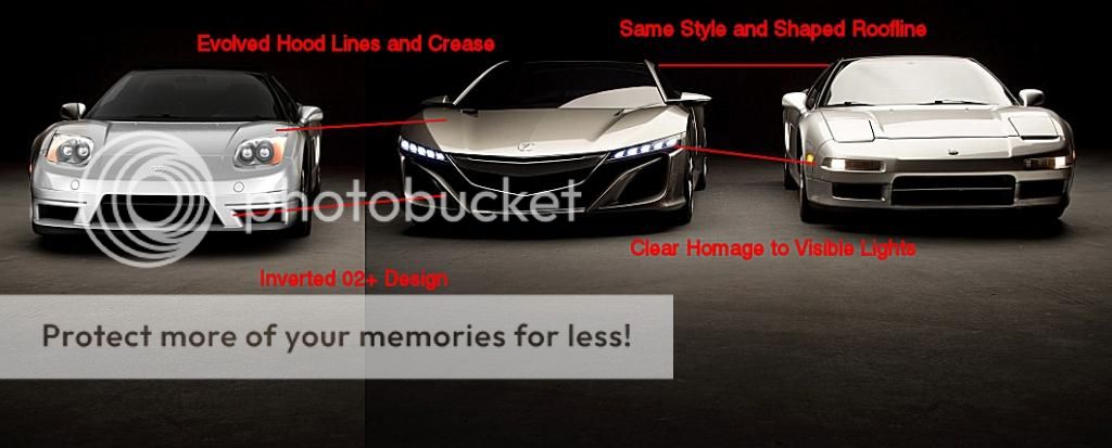
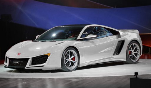
Not trying to steal your idea or spotlight at all vf22, but my suggestion is to make the front intake holes less boxy and conforming. I get where you're trying to take a minimalist approach and simplify things, but perhaps it's too simple and not fully articulated for obvious reasons of it being photoshopped.
I really like what you did...those angles make alotta sense. Wish you woulda did it on the DOT approved headlights version (one w/amber lens and stock hood)
")
No worries at all about "stealing my idea" or "spotlight" I honestly don’t mind at all. Experimenting w/different lines for the sake of any design exploration often has a better outcome when treated as "open source." For the record, it is not my design per say. I have a folder of concept NSX images from over the years where some are official while others are just various magazine fantasy renderings. I thought the front of this one in particular had some merit so I just used it as the basis for the photochop...
Valkyrie Pilot and I actually have talked about this issue with the front a few times in the past and I believe I told him that it would be fruitless until the production trim is shown.
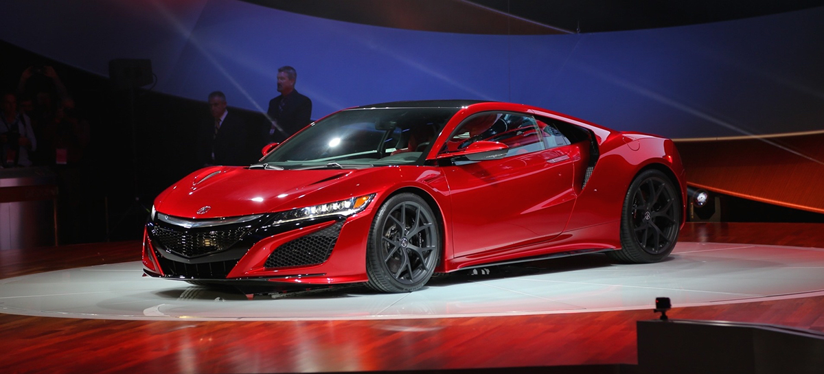
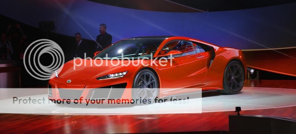
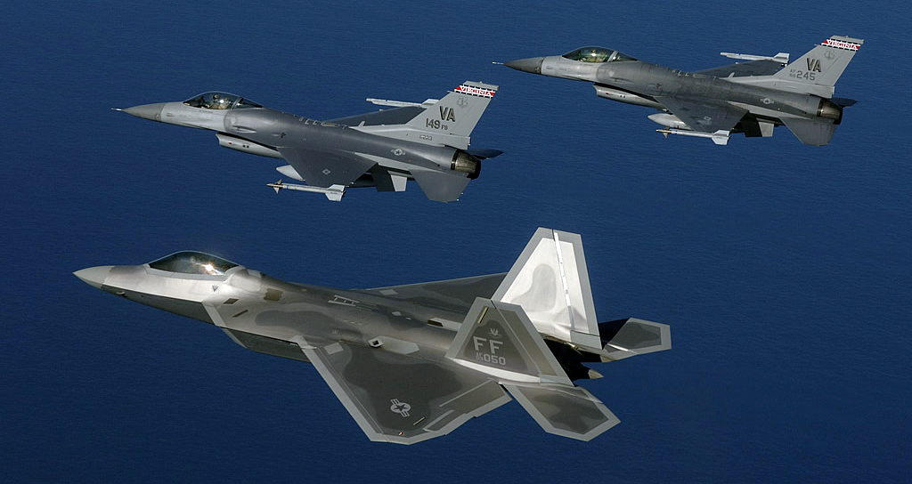
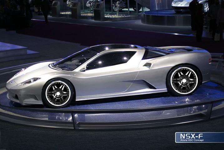
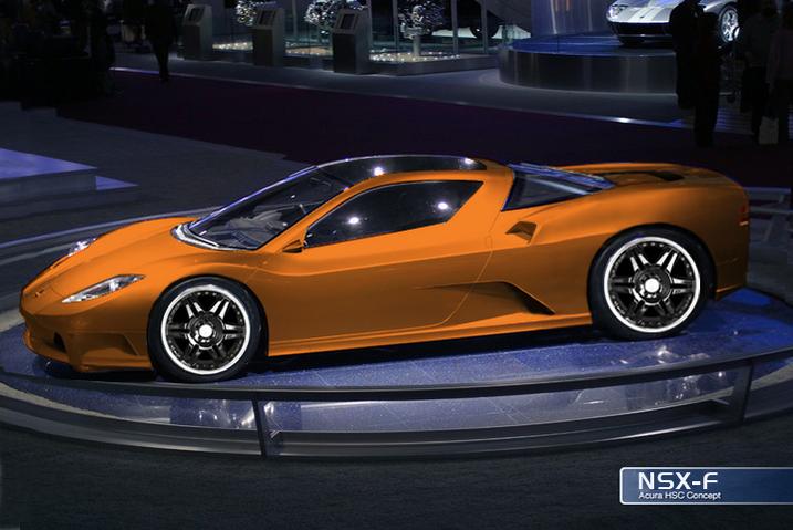
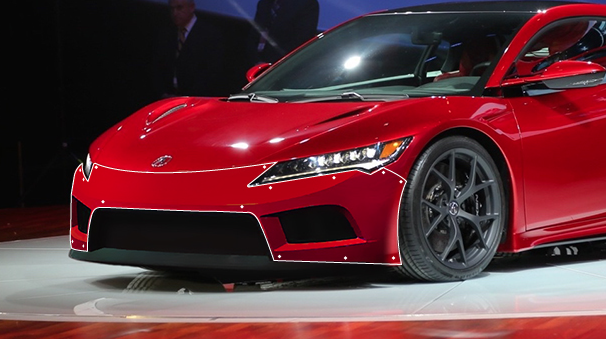
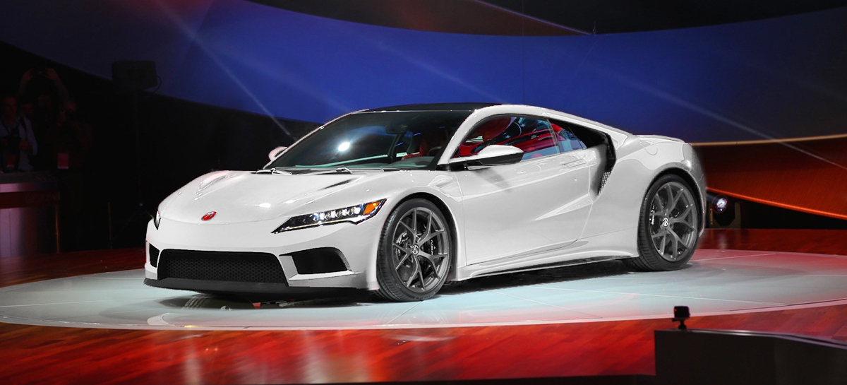
RE: the front. I think the front’s actually where a majority of the hulabaloo towards 2.0 is coming from. For all intents and purposes the front of the car is the “face” of the car and plays a very significant factor in distinguishing one car from another. Take all the exotics you’ve ever known and lop off the front quarter, switch’em around and you’re confused. 1.0’s design objectives included pioneering revolutionary technology while pairing it with a look that tapped into the present-day exotic design vein. They came up with a look that reflected the existing racing heritage; the highly recognizable contour lines of Ferrari’s, Lamborghini’s, aka the “wedge” which had defined modern day exotics since the days of Magnum PI to the modern day Veneno. Hence Ken Okuyama’s concept drawings of the NSX, with heavy Italian influence infused with a powerful, sharp nosed F-16 fighter jet. Almost all of Okuyama’s work exhibits this style, the Enzo Ferrari, the Porsche 996, the Ferrari 599, especially the Maserati Birdcage 75th (pretty cool design), to name a few. Suffice it to say Okuyama has “wedge” design lines running rampant through his veins.
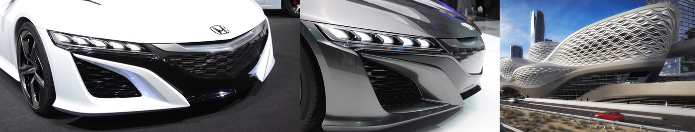
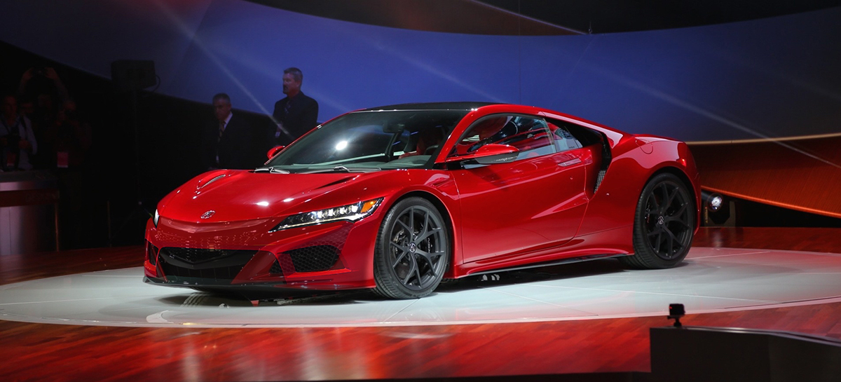
Moving on to Acura Design Division circa 2008+, in contrast this group of young(er) designers have been cultivated in their craft in a very different design environment. In a recent article, NSX 2.0 designer Michelle Christensen gets inspiration from a wide variety of things and places. For ex. take a quick look at the front end of the 2.0 prototypes and the architecture of a metro station in Saudi Arabia that she mentioned admiring...
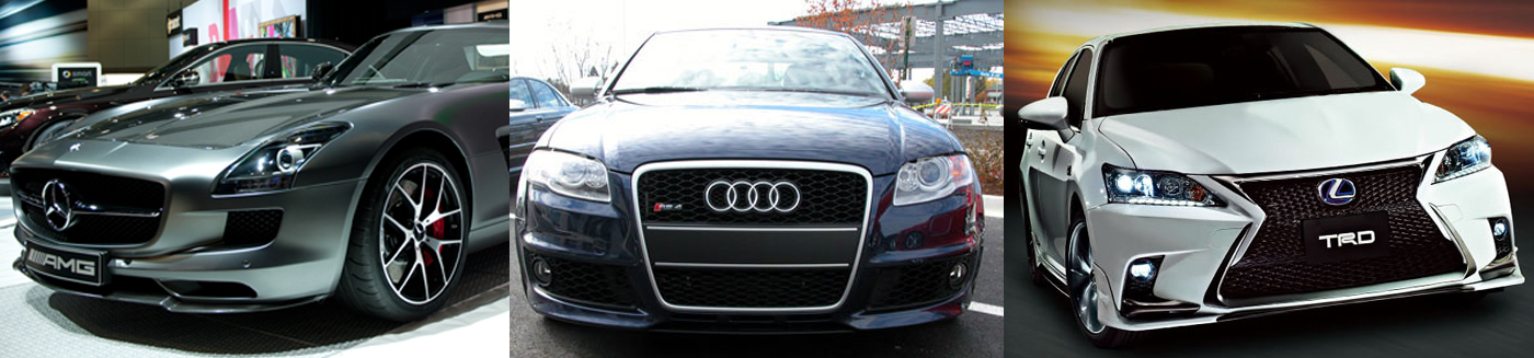
Luxury and exotic contours have clearly been redefined by various European high performance cars where with just one look at the front face and the predominant design element is significant brand emblem swagger framed within massive grill of real estate...
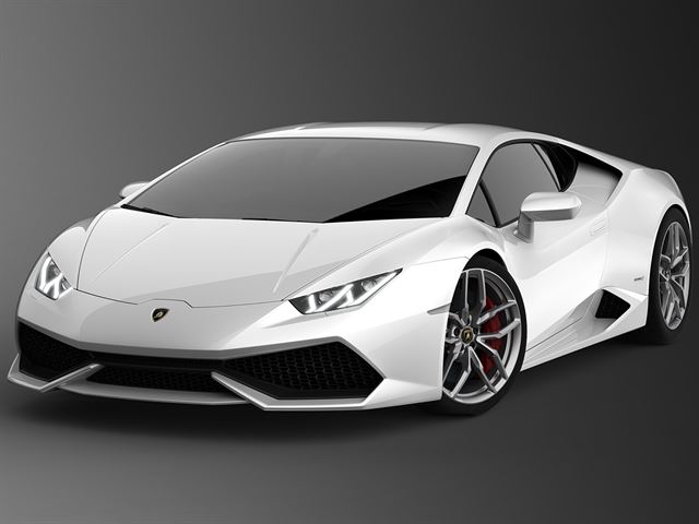
Basically flat, bulgy, barge-like bows (2015 Mercedes SLS AMG) that seem to push the air out of the way rather than cut right through it like a wedge (2015 Lamborghini Huracan).
It’s simply a preference, do you want to buy a pug (flat-nose), or a greyhound (wedge-nose)? Or a bull mastiff or a saluki? Both are just as lovable and who's to say what's better than the other? But in all the necessary 2.0 decisions to be made, it seems as if one that must have not been critical was to carry over the front wedge element that graced the 1.0 face to the 2.0.
I can clearly see that present day the non-wedge style has a much wider appeal, is less snooty, and demonstrates a good amount of design restraint that actually makes it more of a daily driver = less showy while still super classy.
The bottom line is still that 2.0’s “face” is arguably unrecognizable to its predecessor so some are pretty bummed out. It’d be like someone you’ve been with for a decade or two and they decide to go in for some plastic surgery…everyone’s anticipating an improvement…then they come out and you are like, “uh...who are you?” Of course some can say “That looks much better” and is possible but it’s the “Who are you’s?” that I think have been experiencing the unidentifiable face disconnect (admittedly myself included) and is perhaps partly to blame for all the exaggerated negativity towards 2.0.
My $0.02 on how we got to the front that was unveiled in Detroit was neither ‘right or wrong’ but simply a result of a proprietary process, a different design philosophy, and some unavoidable time constraints. It’s fine for designers to look at different stuff for inspiration, but the way Okuyama does it is different. Let’s just hypothetically say if he were Mrs. Christensen's Art Director, at some point early on in the design phase he would have walked up to her desk, politely removed from her idea-wall the photo of the King Abdullah’s Financial District Metro Station in Riyadh, Saudi Arabia with a slight head shake to convey a subtle 'no', and, oh I don’t know, replaced it with a picture of an F-22 Raptor fighter jet, and maybe we woulda ended up with a wedge front
- - - Updated - - -
Anyways, the flying buttress is prominent element of the new NSX design (considering it makes up the whole side of the car), so the intake shape should still match the theme and not stand out an aftermarket bodykit.
Yes the buttress is super clean and incredibly unique imo and I really like how they enlarged the intake on the final! Glad you caught that the bumper idea is just a minimalist approach w/desire to simplify. Imho I think that is what the rest of the car actually is though. Since you’re a designer here’s an analogy that you’re certainly familiar with…limiting amount of fonts used in any given piece/presentation. 2 fonts max, maybe 3 if you have a distinct element you really need to draw attention to. The more fonts you have the more difficult it becomes to read and also the more complicated it appears because now there is more to process in addition to just the information.
Carrying this principle over to 2.0’s front face consider if it doesn't have too many "fonts" (aka materials, styles, geometries) in all fairness. The rest of 2.0’s body elements we see 2-3 font limit - flying buttresses: super elegant, very clean lines, minimalistic brilliantly to the point of the intakes being practically concealed. The rear: super simple lines that pays a great homage to the original horizontal light signature…very few “fonts” again. The roof, the hood, the hatch, etc. all 2-3 fonts max and can hardly see any panel lines! Now the front: (1) The brand-delineator silver beak front and center, (2) Medium-sized-Matte-honeycomb-mesh located under the headlights, (3) Larger-sized-Gloss-honey-comb mesh serving as the central grill just under the metallic silver beak, (4) a solid black beak that is below the over-sized-Gloss-honey-comb mesh under the metallic silver beak, (5) vertically slatted mesh under the solid black beak under the larger-sized-Gloss-honey-comb mesh under the metallic silver beak, next to the medium-sized-Matte-honeycomb mesh on the sides, etc.
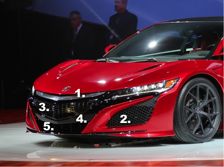
There is evidently quite a bit of fonts here where the design “language” it communicates has already been summed up by others simply stating that it’s just... “too busy”. The rest of the cars canvases do not appear to have as many amalgamation of materials, geometric shapes, from meshes, to glass housings, to polished metals, to matte plastics, to gloss plastics, etc. in one place.
Perhaps a simplified front face would have inhibited their ability to accomplish their air flow goals (function) thus disqualifying retaining the racing wedge look from the 1.0 (form). It was necessary to cut the nose off and let it breath. Who knows, but others can do it, and I think Honda could do it if they wanted.
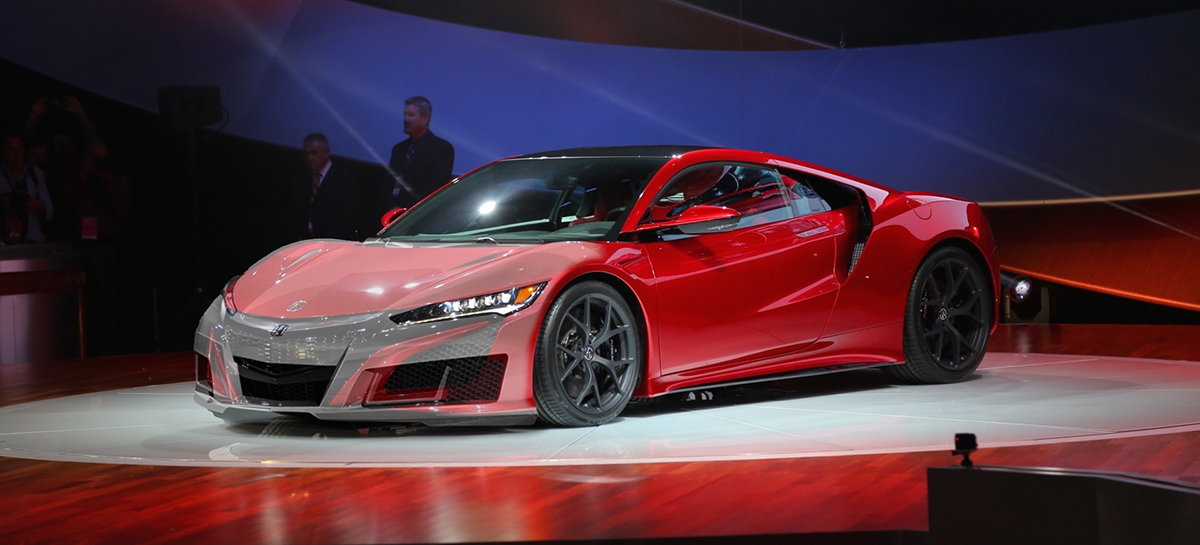
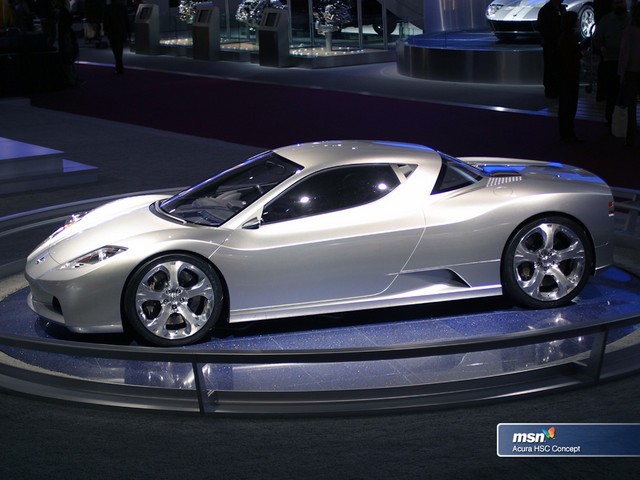
Agreed. The photoshopped version gives me Corvette vibes.
Wa-wait…w/all the “is that a corvette?” 1.0 endured, doesn’t that mean it’s heading in the right direction?
just kidding
It's not a Civic, for God's sake. Just leave perfection alone.
Outta curiosity, did you ever do any modification to your ’92 or ’94?