wow am I the only one who is kinda lost.....anyway.....when I click on suscribed threads it lists all my threads in one long list whereas before it only listed the ones that had new responses and was easier to navigate because it excluded the threads where I was the last respondent.....am I missing a setting?
-
Protip: Profile posts are public! Use Conversations to message other members privately. Everyone can see the content of a profile post.
You are using an out of date browser. It may not display this or other websites correctly.
You should upgrade or use an alternative browser.
You should upgrade or use an alternative browser.
vBulletin 4.x upgrade
- Thread starter NSX Prime
- Start date

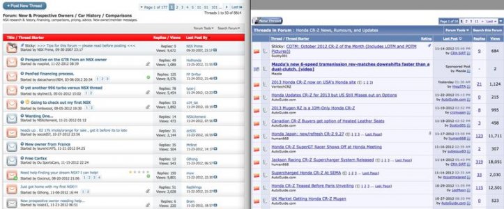
Assuming it's OK to post initial thoughts here and hoping there's room for adjustment - I'm not at all a fan of how some info is now displayed. The older formatting's use of columns and font styles was intuitive and easy to glance thru thread headers, last post, # of replies, and views. In fact I often preferred bouncing to the web-view on my iPad instead of using tapatalk because of this, so I could see more on the same screen size and scroll less often. The new scheme's choice of integrating columns and using softer fonts seems to make it harder to sort thru the info easily and requires more scrolling to see the same amount of info.
Same for when viewing individual threads - it was much easier to follow a thread conversation when the user info was segregated to the left. Now that the avatar & user info is spread out horizontally, it makes following a thread to be very clunky.
Thanks for all the work as always, but this seems like a change only for sake of change and not for the better, just like tapatalk's recent "upgrade" that softened the line between individual posts and reduced the intuitiveness and readability. Like current auto design's fake fender vents, complex & expensive light clusters, and occasionally over-wrought sheet metal creases - sometimes it's ok to put the pencil down and leave it down.") IMHO.
IMHO.
Same for when viewing individual threads - it was much easier to follow a thread conversation when the user info was segregated to the left. Now that the avatar & user info is spread out horizontally, it makes following a thread to be very clunky.
Thanks for all the work as always, but this seems like a change only for sake of change and not for the better, just like tapatalk's recent "upgrade" that softened the line between individual posts and reduced the intuitiveness and readability. Like current auto design's fake fender vents, complex & expensive light clusters, and occasionally over-wrought sheet metal creases - sometimes it's ok to put the pencil down and leave it down.
IMHO.Attachments
Hi,
Can the layout be customized in this way?? to position some things as they were??
Nuno
Agree...Same for when viewing individual threads - it was much easier to follow a thread conversation when the user info was segregated to the left. Now that the avatar & user info is spread out horizontally, it makes following a thread to be very clunky.
Can the layout be customized in this way?? to position some things as they were??
Nuno
- Joined
- 28 May 2008
- Messages
- 2,500
Everything is completely customizable. Let's all remember that Lud only implemented the new version and default template less than 24hrs ago. There are a LOT of things that need to be configured in order to adjust things. My guess is that he has prioritized functionality first with various plugins, Enthusify, Wiki, etc.
We're still at about 98% default - the only change he made so far that I can see was a single color from blue to red.
We're still at about 98% default - the only change he made so far that I can see was a single color from blue to red.
wow am I the only one who is kinda lost
No. This is going to take some time for me and might be the best time for me to pull back from the forum. I just don't think I want to put the time into adjusting or accepting the change. I'm not angry or upset, I'm just not interested in putting in any time at all to re-learn my way around. I'll do something else with the time.:smile:
Hi,
Originally Posted by Yinzer
Same for when viewing individual threads - it was much easier to follow a thread conversation when the user info was segregated to the left. Now that the avatar & user info is spread out horizontally, it makes following a thread to be very clunky.
Agree...
Can the layout be customized in this way?? to position some things as they were?
I agree 100%. It also lengthens the posts from top to bottom creating the feeling of much too much vertical "empty" page space.
Last edited:
I agree 100%. It also lengthens the posts from top to bottom creating the feeling of much too much vertical "empty" page space.
I agree with this too. Having the user info on the left was easier to follow. The pages are getting too long this way.
Looks good Lud, thanks.
Hi,
i think we are making suggestions, at least i am, so Lud checks here when he can and implement or discuss the ones he
thinks are worth a shot...
Nuno
i don't see anyone with a shotgun to Lud's head here :tongue:Everything is completely customizable. Let's all remember that Lud only implemented the new version and default template less than 24hrs ago. There are a LOT of things that need to be configured in order to adjust things. My guess is that he has prioritized functionality first with various plugins, Enthusify, Wiki, etc.
We're still at about 98% default - the only change he made so far that I can see was a single color from blue to red.
i think we are making suggestions, at least i am, so Lud checks here when he can and implement or discuss the ones he
thinks are worth a shot...
Nuno
The upgrade looks great! I was wondering if this would change at all on TapaTalk at all and from the looks of it, it hasn't which is nice.
That is pretty cool. Will have to play with some more of the new features when I have time.I love the new "Activity" view and feel better about using it vs. constantly hitting the search engine for latest/unread posts.
Thanks Lud!

congrats on a smooth upgrade, lud, and for all the time & expense you've invested over the years making prime the best nsx site on the planet.
This upgrade looks great! Totally brings it out of the 90's theme. =)
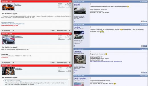
Profile info on left of post (before) requires less vertical scrolling, but profile info on top (current) means wider embedded photos will fit on the width of narrower screens. Other benefit to on left was it was easy to zoom in on mobile platforms (on just the right column)...but the new software uses a different display format for mobile which is much better. The new software is a win for me, just for that (improved mobile experience). I also like the way replies open up a new section where you hit reply, instead of opening a new page and going to the end of the thread. That will make it easier to pick up reading, after replying, where one left off. I imagine we'll uncover more things to like as we use the new site.
- - - Updated - - -
OK, I do have a question/confusion. On the man thread listing. There is orange open envelopes and blue open envelopes - what is the difference? I figured out that gray closed envelopes mean "read, no new replies."
- - - Updated - - -
Ok, that is interesting...when I post another reply it just appends to my last (if my last was the last in the thread).
- - - Updated - - -
- - - Updated - - -
- - - Updated - - -
- - - Updated - - -
Ok, ok, ok, ok - enough from me already.
- - - Updated - - -
I lied, one more comment. The mobile version is pretty generic (complete with "vBulletin" logo). You (Lud) will probably want to adjust colors/logos to make it more NSX-Prime-like, and make sure ads show up on mobile so monetization doesn't decrease.
- - - Updated - - -
OK, I do have a question/confusion. On the man thread listing. There is orange open envelopes and blue open envelopes - what is the difference? I figured out that gray closed envelopes mean "read, no new replies."
- - - Updated - - -
Ok, that is interesting...when I post another reply it just appends to my last (if my last was the last in the thread).
- - - Updated - - -
- - - Updated - - -
- - - Updated - - -
- - - Updated - - -
Ok, ok, ok, ok - enough from me already.
- - - Updated - - -
I lied, one more comment. The mobile version is pretty generic (complete with "vBulletin" logo). You (Lud) will probably want to adjust colors/logos to make it more NSX-Prime-like, and make sure ads show up on mobile so monetization doesn't decrease.
Last edited:
Lud...
Nice job as usual.... big thumbs up!
Nice job as usual.... big thumbs up!
Last edited:
Change is bad. With that said, I hate it.
Old header gets my vote also.I second that.
Great work with the upgrade, all went smooth from my perspective. I appreciate the work you do to keep the site rolling
- Joined
- 21 December 2005
- Messages
- 1,215
I would have stayed w/ 3.xxx & just had new themes made. There are waaaay more mods and features for 3.xxx. Some people like myself, hate the look of 4.xxx & may just stop coming to prime all together. At least with a theme you can have the upgraded look but give users the option of reverting back if they want.
I'm going to give the new layout a week before posting feedback, good or bad. Initial reaction to change is often due to shock and not necessarily a good indicator of whether the change was positive or negative. I would take the first impressions with a grain of salt, Lud. Thanks for giving up your weekend in order to perform the software upgrade. I hope you had a nice Thanksgiving.
Similar threads
- Replies
- 0
- Views
- 179
- Replies
- 0
- Views
- 263
- Replies
- 0
- Views
- 199
- Replies
- 0
- Views
- 288