• Protip: Profile posts are public! Use Conversations to message other members privately. Everyone can see the content of a profile post.

NSX 2.0 Body Kit

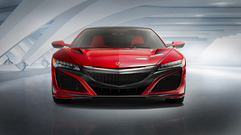
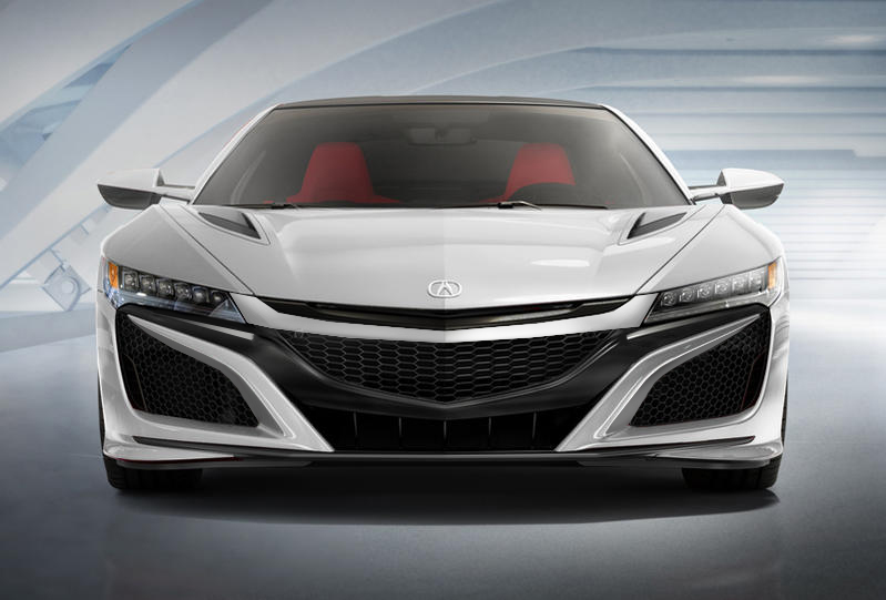
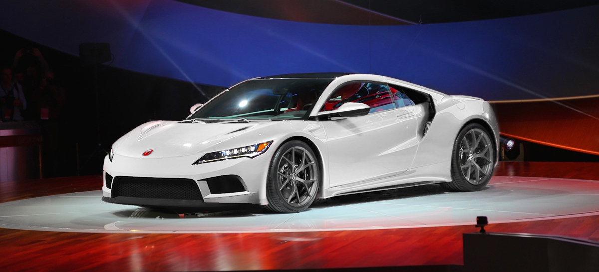
...the problem with using a Mazda front end here is that it destroys the best part of the design - namely the outer sharp edge that leads the front wheels. In the current NSX design, it provides short front overhang and a flat surface that avoids the front wheel from being framed by ... nothing. Honda is trying to embody an arrow front-end when viewed from above, not a square front-end like typical car designs. When you take this concept to the max like in the S2000, you have a combination of a wedge front-end but when viewed from the rear 3/4 shows nothing in front of the front wheel arch. This can look a bit odd.

That is why in my opinion, the S2000 looks greatfrom certain angles and not so great from others. If you are trying tokeep the front overhang short, I believe its either this design or you are leftwith either an S2000 look or a rounded look like the Corvette:

Here you go...
corv_nsx_compare.jpg


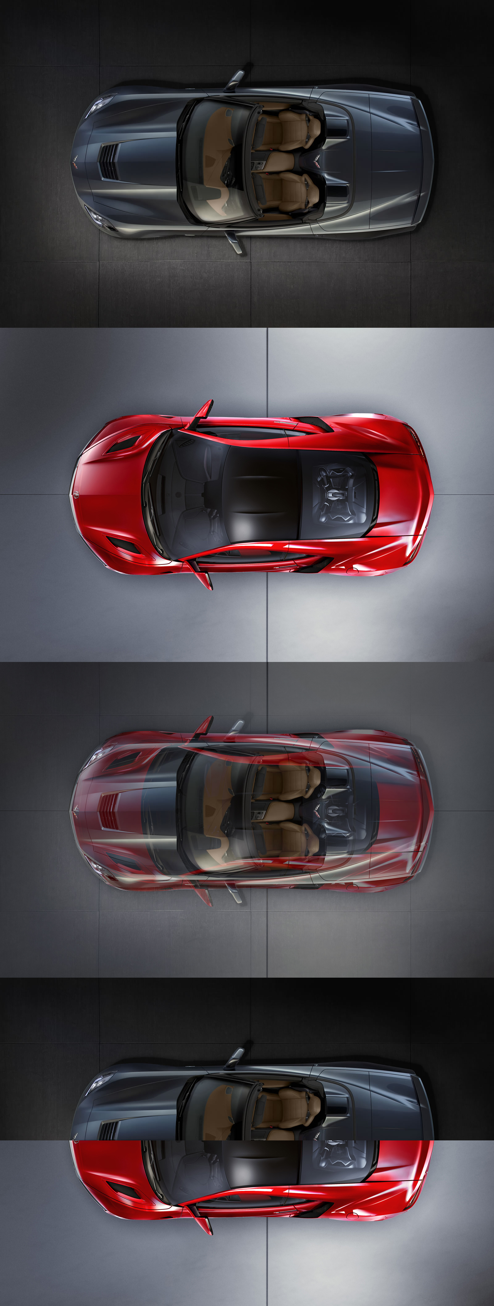
So this is based up on the 2015 Corvette being 176.9" and I read that the new NSX is 3.1" longer than its predecessor making the total 177.3" (0.4" difference). I hadn't really paid attention to that outer sharp edge leading the front wheels and isolated it as an actual design plane until you mentioned it...that's kinda interesting. I'll have to reread what you are saying to try to understand and absorb. That aero front from above does show it is much different than I had thought...it practically matches the vette's aerial contour. So when you mentioned its either this design or you are left with either an S2000 look or a rounded look like the Corvette I am not sure I yet understand what is "this" design is in terms of describing it?
 
The top and side views makes one appreciate mid-engine platforms much more if one favors balance. The seating position and proportions are so much better than the FR Corvette. I can't wait to see the MR Vette tho if they are actually doing it!

Also, it's 3.1 inches longer than the 2012 concept which was actually shorter than the original NSX. Most places are reporting 176 inches long, so not quite 177.
 
That looks great, Just what I was trying to do. It really highlights the "arrow" front end of the NSX design. It tapers sharply without loosing its sharp angles. Totally avoids the rounded front that the Corvette has.

So when you mentioned its either this design or you are left with either an S2000 look or a rounded look like the Corvette I am not sure I yet understand what is "this" design is in terms of describing it?

By "this design" I mean the design of having large side intake vents. If you are trying to design a front that "cuts the corners off the square" so to speak, while at the same time hoping to avoid a rounded front end, the side intakes may be the only way to accomplish it. (Or alternatively use the S2000 design.)

Did you get my point about the the flat section that leads the front wheel? Without it, you have something like the S2000. IMO, the S2000 doesn't look so hot in the front from this angle:

2328258342_402f0ba6d2_b.jpg
 
Last edited:
That looks great, Just what I was trying to do. It really highlights the "arrow" front end of the NSX design. It tapers sharply without loosing its sharp angles. Totally avoids the rounded front that the Corvette has. By "this design" I mean the design of having large side intake vents. If you are trying to design a front that "cuts the corners off the square" so to speak, while at the same time hoping to avoid a rounded front end, the side intakes may be the only way to accomplish it. (Or alternatively use the S2000 design.)Did you get my point about the the flat section that leads the front wheel? Without it, you have something like the S2000. IMO, the S2000 doesn't look so hot in the front from this angle:
Yes, that example on the S2K makes a lot of sense now. That effect reminds me of of the rear spat on the 91-01 NSX. It looks fine from the side but instead from a front 1/4 angle would kind of disappear because it tapers away pretty steep and would make the rear look vertically thin.Check out the exploration below in regards to incorporating that arrow front end (w/out any corvette curvature). More S2K-ish but has an outer sharp plane leading from the front wheel well so the front end won't not disappear from rear 1/4 view. This chop borrows lines from another never-made-it-to-production vehicle and would obviously be more than a front bumper swap...it would need hood, fenders and headlights :rolleyes:
nsx_concept_gr.png
 
^ I must admit, that looks fantastic. I always liked the front end of the Lotus Esprit Concept. It also reminds me quite a bit of the Huracan which I also think looks great. And for that matter, it also looks like the S2000 Concept that was floating around here a few months back.

Pros:
-Its Simple
-Its Mean
-Its angular
-It is evolutionary of the 2002-2005 NSX

Cons:
-It still has significant corners (and kills the dramatic tapered creases over the front wheel arches that narrow to the chrome strip)
-It looks similar to other current designs (Lambos)
-It will never happen because it does not incorporate the company design language

Apart from what I drew on page 2 (or even the production NSX) this is probably my favorite "chop".

Any chance you could do a proper photo shop on one of my renderings?
 
Last edited:
Here are two options that attempt to work with the existing design:

View attachment 119985 View attachment 119986

I know its hard to completely tell what I am suggesting, but I really think the side vents work well with the mesh and you could continue that to the small slits below the LED headlights (assuming the black plastic was removed there). The center grill, however, could be left uncovered like our cars which would simplify the front and at the same time make it look high-performance. And like Yinzer suggested, paint the back strip beneath the chrome strip the body color.

OEM...
oem_front.jpg


Valk Sketch 1 of 2...
1of2.jpg


Valk Sketch 1 of 2 alt...
1of2alt.jpg


Valk Sketch 2 of 2...
2of2.jpg


Yinzer colorization w/oem front...
front_body_color_strip.jpg


Valk sketch 1 of 2 w/Yinzer colorization...
front_grill_alt.jpg


Valk sketch 2 of 2 w/Yinzer colorization...
front_alt_more.jpg


Several of these do seem to simplify the front end as others suggested and imo better match the simple, classic lines of the side profiles and rear. I also prefer not having the central bulging-like element that protrudes outwards as these mock renderings for an alternate front bumper remove that.

The chrome strip "beak" isn't going anywhere since the entire lineup is using it and they definitely want to connect this halo car to the other models.

They guy who penned the new NSX, Toshinobu Minami, said in an interview..."Although Toshinobu Minami, Acura’s new global design chief, wants to change almost everything about the looks of Honda’s premium brand and he opted to retain one of its most striking features – the so-called “beak.” According to Minami, the beak, the brand’s shield-like double pentagon grille, may have gone too far in the past and but people are starting to like the look. Minami said the basic design language of the Acura will remain, with some minor tweaks. In a recent interview, Minami admitted that they may have gone overboard in some aspects. Minami also said that although Acura received much criticism on the “keen-edge” grille design (aka the "beak"), they are not going to buckle under that pressure."

Not going to buckle under the pressure? What does that mean in this case? That just kinda sounds like code for obstinate. I don't think it really could get any more simpler than the "criticism" was simply that people just didn't like it. What should you do, don't take it personal, hit the drawing board and find something more people will like (or at least not make fun of). Acura Brand Management might have insisted to their design team, "No it's too late, the beak's already out, you gotta live with it...we're running with it...we have to establish a consistent look and it's already out." Well too bad it made the cut then the first time. So you're right...we then have to live with it too. But the bottomline in this case is, what does a customer want?...a good looking car and a brand name they can trust. What does the car maker want? sales...and lots of them. So it boiled down to, Do you keep your consistent "beak" at the cost of voiced customer dissatisfaction and criticism (decreased sales) or, Do you try to make something new that has better/wider appeal (or at least avoids criticism) but at the cost of not getting to have your distinct looking grill (but increase sales)? The company believed its opinion was better or smarter than the market. This is a treacherous train of thought for any business. At the most elemental level, no company is smarter than its customers. It is the customer who knows what he will spend his money on.

But your point makes for an interesting design observation though...how do you quickly distinguish from all the TV's at Costco...you just look at the little emblem. If a company wanted to go all fancy on you and have these incredible angular protruding edges to make their flat screen televisions more recognizable, that's fine, but not at the expense of people not liking it or feeling like it distracts from actually just watching television. Acura did great when they their front air dam was not a "frame" but rather just low profile hoods across the line up (that was distinguishing visual element back then)...more so than their competition like a comparable Ford or VW sedan with flatter fronts, higher hood lines, and bigger grills.

comparison.png


I think sometimes designers forget that there's already a primary design element in place that's assigned that responsibility for brand recognition on any product and it does a great job...their emblem. A shoe is just a shoe...it can be any shoe of any kind of any stye...now slap a Nike swoosh on it and you have instant brand affiliation. In a weird twist, a designer may begin to think that their logo is not enough to distinguish their brand so they want to add another element to make it bigger, in this case a grill. I think the mistake (or the 'gone too far') that was made here was that the paramount goal in making your brand more distinguished shouldn't be isolated into a single design element or piece (like a beak) for greater recognition but rather...focused on the entire styling of the car itself collectively. If you do that right...the grill will be right. Kia is doing a great job of this right now. I can recognize a Kia from almost every angle and it's by overall design style not a single element. Ironically, I can't even recall right now what a Kia grill look like :rolleyes: The NSX 1.0 actually did this "overall" branding thing when it first came out...no "NSX" model name was even on the back or front, no "A" emblem on the back or sides...just one "A" emblem on the front and two "NSX" emblems on the side and "Acura" one the wheelcaps and tail center. Their grill did not match the style of any other car they had made before, their headlights did not match the style any other car they had made before, their parking lights did not match the style of any other car they had made before, their wedge front bumper did not match the style of any car they had made before, etc. Yet everybody that mattered to its success in the car world knew "ACURA NSX".

In contrast, the NSX 2.0 headlights (now DOT approved with amber marker and barbed design) now just look like the TSX, MDX, RDX, etc. headlight. The front beak (although now scaled back) just looks like the TSX, MDX, RDX, TL, RL, ILX, etc. front beak. One can argue that that was the point, but it is just my opinion that this consequently actually affected the design of the front of the 2.0 in a negative way because it actually forced them to have to hold back because they had created these design parameters...something the 1.0 was never subjected to. It was totally possible for them to stick with the tiny slit headlights that were so slick on the concept and looked so aggressive. Even the Jeep Cherokee has these kind of lights which are DOT approved. But instead each revision of the headlights went from concept...aggressive slit, to production...lineup imitation.

headlights.png


This literal insistence that this must be, in order to have brand recognition was just totally the opposite of 1.0 w/out highly resembling the rest of its line up in headlights, grills, etc. and it still succeeded in its job as a halo car or else I'm not really sure or able to explain why in my lifetime I had bought a Prelude, an Integra, and a Vigor out of all the cars I coulda bought leading up to an NSX.

Again, some will say that was the point and from a design stand point I get that but there's more to it than that to make a prestigious brand. I just think that it would have been better for the purpose of focusing on their target market's prestige factor (for all we really know is that they have $160,000+ to spend on a car) to not have strong noticeable resemblances to their TSX/MDX headlights, an RL/TL grills, etc. (like the 1.0 did not to its line up) and just delegated the brand affiliation quotient to the emblem and the bigger picture of how awesome the car's gonna be.

In this scenario, the beak and headlight pattern is not necessary on the halo so it can then have a look that is distinct and separate from the lineup; and ideally with more resemblance to the legendary 1.0 front for greater recognition and design heritage. Which ultimately would really allow the prestige buyer in this exclusive price range to be able to spend this kind of money and still really feel a cut above the rest vs. not feeling like (I did not say is like) that they had just spent 160 grand on an overpriced middle-class-looking luxury car.

(And look at the bright side, at least they have something better than the current Lexus "X" grill.)


Yes...when I see them on the road I can't help but think of a glorified snow-plow.

snowplow.jpg
 
Last edited:
Several of these do seem to simplify the front end as others suggested and imo better match the simple, classic lines of the side profiles and rear. I also prefer not having the central bulging-like element that protrudes outwards as these mock renderings for an alternate front bumper suggest.

Nice work VF! And I appreciate your analysis about the constraints that companies place on their designers. I think you may have a point about Acura working too hard to keep their cars having the same shield/beak. If there are other design traditions that Acura could implement across their line, what would or could they be?

This one is probably my favorite of the bunch. Yinzer's suggestion really seems to help keep the center intake from looking too big:


front_alt_more.jpg


Can I make a few more tweaks? What if you removed the black plastic under the lights and replace it with the mesh? And what if you extended the lower white horizontal planes at the bottom of the side intakes so they continued across the middle and joined together? (It could be placed on top of the black splitter that frames the bottom of the center intake.) Finally, what if the little white bridges that connect to the upper edge branched off from lower on the intake "wings" and then curved in to approach (but not touch) the hood creases? This would help to limit the size of the center intake. What do you think?
 
Last edited:
Gosh VF

The time and effort you have put into this thread has drawn me to "one inescapable conclusion" lol...You really hate it

But guess what? many absolutely love it !

I agree with many of your points, especially that it should not have looked like any other Acura ....

In fact they should have badged it Honda this time and given it a simple but effective gas motor (one last great motor) that any Honda dealer could service ot repair.

But it's over, car is here. . it is Honda's NEW SPORTCAR EXPERIMENTAL and we, as haters, must live with it lol.

IMO, it had better be the ABSOLUTE GOLF CART from hell or it may bomb.

S
 
This literal insistence that this must be, in order to have brand recognition was just totally the opposite of 1.0 w/out highly resembling the rest of its line up in headlights, grills, etc. and it still succeeded in its job as a halo car or else I'm not really sure or able to explain why in my lifetime I had bought a Prelude, an Integra, and a Vigor out of all the cars I coulda bought leading up to an NSX.

It's easy to really enjoy your posts; nobody's humored my beak-whining as much, ha ha. We definitely think a lot alike even though I always thought the entire Acura lineup in the early 90's looked unmistakably similar, particularly near the front reflectors/running lights and middle lower inlets. The below pictures illustrate that well I think. If the NSX below had phat phives, the similarities would be even more striking. Acura styling was so easy to admire back then; classy, unique, and unmistakably sporty/luxury Honda. Acura did it much better than say, Ford did in the late 90's where the Escape/Explorer/Expedition/Excursions and ovalized Taurus/Contour/Escorts looked a bit too boringly similar. Like you, I'd daydream of the NSX and it'd morph into desire to also want a Legend or Integra.

acura.jpg
6330050001_large.jpg


Thanks for pacifying my requests and then actually putting them into images! Though I still think there needs to be some body color under the leading edge of the hood to avoid the "Ike from South Park" look.

Not to beat the dead horse on the 2.0 beak but...I'm reminded of the Lincoln LS from around 2000. Ford intended it to go head to head with the BMW 3 Series but the prominent & shiny grille and chiseled front/rear bumper chrome strips were so stylized that they made the LS look too...formal and fancy to be considered a sports car like BMW was able to easily pull off. The 3 Series at the time was like James Bond wearing an Omega watch 24/7 while the Lincoln LS was like Bond wearing a tuxedo for the entire movie.... The first seems believable while the other would be unrealistically distracting and silly to even think about IMHO. NSX 2.0's crystal chandelier hanging from the front distracts from its sporting intentions IMHO.

2001_Lincoln_Ls-2.jpg
4028520005_large.jpg


Yes...when I see them on the road I can't help but think of a glorified snow-plow.

snowplow.jpg

Fantastic comparison, I so agree! Yuck.

Honestly though I'm glad to hear that many here love the 2.0 beak. I would not want to live in a world where everyone agreed with me and thought like I do.
 
Last edited:
I think these are cool and interesting approaches, but the front end really looks a like new LFA now with the Acura nose missing... I also think the front air dam is too big now too.
 
we have a winner!!!!!!! I likey......458 be damned.....:biggrin:
 
I cant believe that the focus is not on the rear end. To me, the front and the top are the most atractive parts of the car. The back is the least agressive and most boring part of the new NSX. I liked the NSX-R * rendering but still to basic of a spoiler. I would like to see and artist rendition of the original rear end of the 1st generation NSX "negative spaced spoiler".
*image.jpg
 
Last edited:
Woah...I just saw something I never noticed before :eek:...

stay_puft.jpg

...LFA is angry!

Takes me back about 30 years to Ghostbusters with Bill Murray:

https://www.youtube.com/watch?v=oPr7cYLq3dk

"1-2-3 let's roast him!" lol

- - - Updated - - -

for any who thought HSC "looked" promising ;) basic idea: HSC front bumper kit

HSC_front_bumper_kit.jpg

Not too bad Vf. But it loses the tapered front corners.

And like you said before, this would require more than a front bumper kit.
 
Back
Top